Corporate Design

GORE Cover

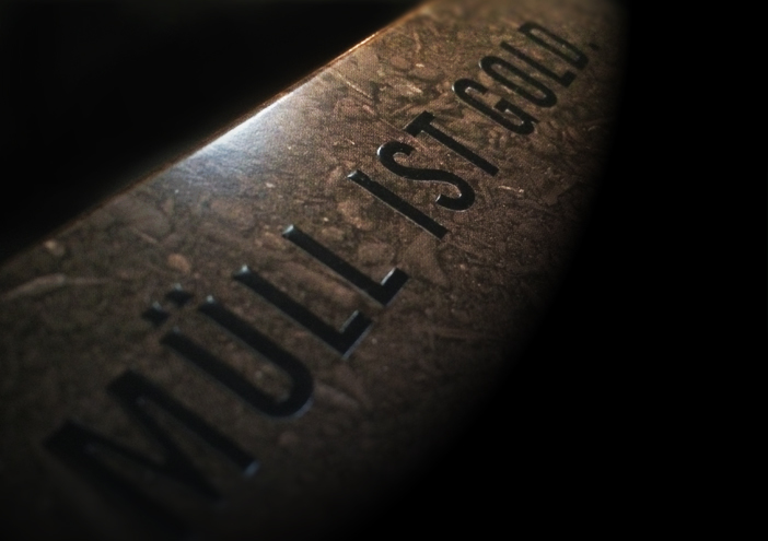
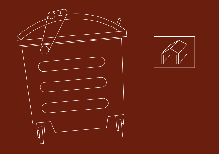
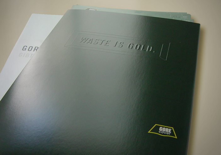
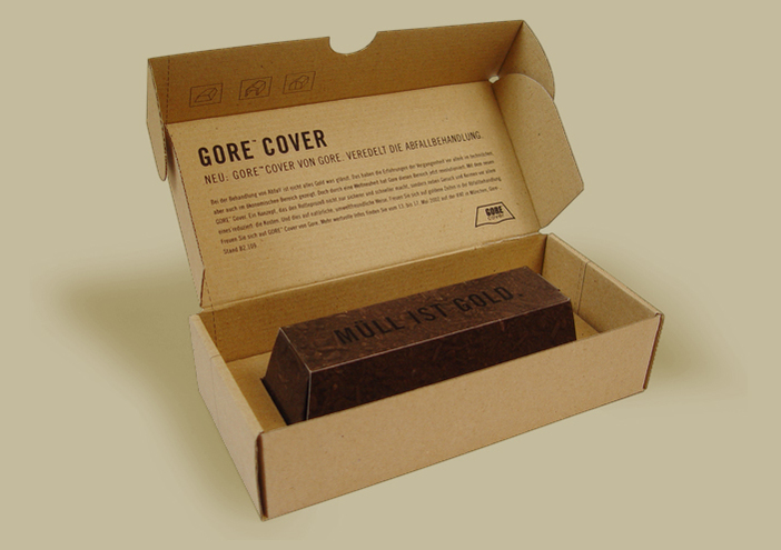
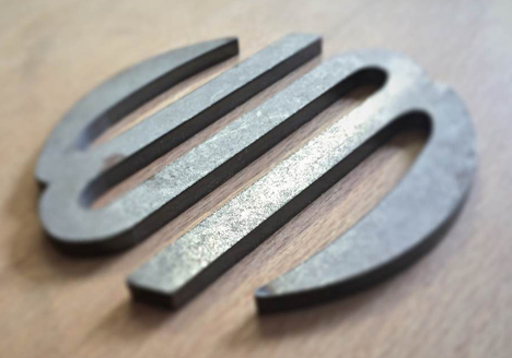
"Waste is gold" - this expression occupies the centre stage of the coporate design, developed by wertmarke for the company GORE Cover - a subsidiary from W.L. Gore®. The central statement- converted into a gold bar- was interpreted for their communication tools in several ways.

Zurück zur Übersicht

Gore cover logo
Gore cover bildsprache
Gore cover icon2
Gore cover mailing1
Gore cover icon3
Gore cover broschuere
Gore cover teaser klein

Corporate Design

further interesting projects

VIVOTEC

VIVOTEC Corporate Design

Client and VIVOTEC- owner Hubert Verhak is the inventor and worldwide patentee of O2- technology in the food...

Störtebeker Braumanufaktur

Störtebeker Braumanufaktur Interior Design

The Störtebeker Showroom is located in the modern annexe to the existing historical brewery. Room elements and furniture were designed which combine ordinary europallets with steel and concrete. Besides the pure...

Kunstschule Wandsbek

Kunstschule Wandsbek Interior Design

In the course of the corporate design relaunch of the KW wertmarke develops new interior ideas for the school‘s classrooms. Accompanied by the new logo which...

Binzer Bucht

Binzer Bucht Corporate Design

In einem 18-monatigen Markenbildungsprozess entwickelt wertmarke die neue Dachmarke „Binzer Bucht“ mit den Submarken „Binz“ und „Prora“. Entstanden ist ein Corporate Design für den...

get in touch with wertmarke

Contact

wertmarke hamburg GmbH
Alte Druckerei
Bahrenfelderstr. 73b

D-22765 Hamburg

Inquiries